TOO SALTY: Cracker Barrel’s Rebrand Failure & Lessons To Apply To Real Estate Marketing
TOO SALTY: Cracker Barrel’s Rebrand Failure & Lessons To Apply To Real Estate Marketing
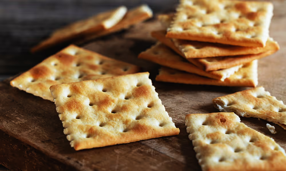
You might think that chicken-fried steak, BBQ ribs, and grits have nothing to do with real estate marketing. But you’d be mistaken. The Cracker Barrel rebrand, revealed in August 2025, caused a stir on social media — and nearly led to the collapse of this major restaurant chain. Currently, there are 657 Cracker Barrel restaurants in 44 states in the U.S. The issue wasn’t the design execution; it’s actually clean, nicely pared down, and in line with current trends in restaurant marketing and merchandising. All marketing efforts must adhere to core marketing principles to be effective and strong. The real problem was the disconnect with the audience. At P11, we believe that there are always new marketing lessons to be learned from different industries. Enjoy this P11creative fresh-from-the-griddle, post-game wrap-up with branding tips (and some helpings of food-related puns).
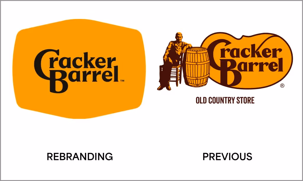
WHAT LED UP TO THE REBRAND RUCKUSLet’s get some context. As with the evolution of many brands over the years, the new Cracker Barrel brand decided it was time to streamline and modernize its brand and in-person presence to something sleeker and less cluttered to “appeal to younger customers” and broaden its appeal to attract new customers that was more contemporary. It’s a good practice in business to consider how brands can expand and reach new segments if appropriate and profitable. We’re all looking to expand the possibilities and grow our companies. In Cracker Barrel’s new market segment quest, the iconic and cozy “Uncle Hershel” illustration and the “Old Country Store” verbiage, which had been used since the brand's origins in 1969, and beloved by its die-hard, decades-long consumer base, were given the boot, kicked off their porch, and the branding was simplified to the tune $700 million and included a new brand design, color study, new curated brand palette, new fonts, new textures, new theme images, new messaging, new displays, restaurant signs, road signs, social media, website, — the whole 9 yards. They also updated the in-person experience at the restaurants to be lighter, brighter, and more efficient. The marketers behind Cracker Barrel wanted the brand to evolve, and I dare say, and it hurts us to use this analogy, more “hipster” meets “yuppie.” This new logo included an “emblem-inspired” design/silhouette feel. This trend has had a significant impact over the years, particularly among younger candidates running for office in political marketing. So, CB went with a cracker charcuterie board, and less cracker barrel. That’s when the client base almost flew the coop for good.
THE NOT SO GOOD GRAVY AFTERMATH (OR SHOULD WE SAY ‘AFTER WRATH’)The Cracker Barrel audience exploded in negative and furious outrage at this branding debacle that it would make Mt. Vesuvius blush. And CB Stock plunged nearly 7–16%, wiping out millions in value. Let’s just say it was not the celebration they hoped it would be. Immediately after a deluge of public and financial pressure, within days, Cracker Barrel followed the hallowed advice of 90s philosopher Missy Elliot and “flipped it and reversed it” to return to its nostalgic, original brand design. All with public relations classic talking point — “You spoke. We listened.” Kudos to them for speaking out almost immediately. It’s also important in p.r. to react immediately and mindfully to these kinds of self-imposed marketing blunders. It was a harm-to-table situation. Tom Murphy, a branding expert and professor at Clark University, told CBS MoneyWatch, "The decision by Cracker Barrel to return to its original logo is a positive course correction, given the intensity of emotional response from their core base of customers.” Their customer base did not want anything looking like a Starbucks, Panera, etc. They wanted their familiar “cozy” brand back. This gave the folks at Cracker Barrel an opportunity to reinforce the fact that they are not moving away from their brand purpose or their heritage."
P11’s TAKEAWAYS FOR THE MULTI-FAMILY & DEVELOPER INDUSTRIESNow, let’s clarify how this relates to what you can do to properly brand or rebrand your community.
A BRAND REFRESH IS WHAT YOU MAY REALLY NEED.Many national retailers and businesses, such as Walmart, Adobe, and Eventbright, are big believers in brand refreshes and have done them right. A brand refresh is when the core elements of the existing logo remain (such as the original colors and possibly the fonts) and get a subtle and more clutter-free “polish” to be more in step with the times. It could entail brightening the color palette, simplifying shapes, or just taking off the distractions.
IF YOU’VE ACQUIRED A PROPERTY, CONSIDER A NAMING STUDY.If this is an existing community you’ve acquired or are renovating, we recommend conducting a naming study to establish your identity. This will attract attention from your desired audience. P11creative specializes in naming and renaming solutions and branding for communities, as seen with Paladia, BASK, and Mariblu.
NEVER UNDERESTIMATE THE POWER OF FOCUS GROUPS & AUDIENCE TESTING.Whether you’re a developer seeking to build a community in an old and very established part of town, listening to the actual people living in the neighborhood and city is critical. Their input and acceptance will particularly be crucial in a city’s entitlement process situation. This is also very important in the 55+ living sector.
WHEN IN DOUBT, TAPER THE REBRAND ROLLOUT.Cracker Barrel’s ginormous Achilles heel was a failure to test or phase changes and listen to the people, especially with legacy fans. The total rebrand was rejected by its audience without any vetting or due diligence. If Cracker Barrel had tapered the rollout in one small zone and then mindfully expanded it to another slowly, it might have had more time for the audience to adjust and be more receptive. Just like a phase release, you want to build momentum and interest steadily.
REBRANDS ARE GOOD. JUST KEEP YOUR BRAND’S “UNCLE HERSHEL”.Modernization must serve, not replace your brand. A rebrand can encompass the past and the present. This is where storytelling and outgoing messaging can make or break you. Emotions remain at the heart of marketing and brand ideation and should be leveraged to strengthen strategy. After all, we market where and how people live. Like Cracker Barrel diners, real estate audiences — especially in heritage neighborhoods or historic developments — and regions of the country cling to identity markers. Strip away the essence, and you risk erasing trust, attachment, loyalty, and having your new development get axed before it ever gets off the ground. Let’s say you’re creating a new multi-family community on a time-honored but long past its prime venue and parcel of land. Incorporate elements from that venue into the new community. If your property used to be a car sales lot, find historical photos to create a floor-to-ceiling mural. Or if parts of the old signage or building are available, find a special place of honor for them in the new community you’re developing. That demonstrates that you realize local history is important to the area and potential new residents.
PRACTICE MINIMALISM WITH MINDFULNESS.Minimalist logos and sleek, neutral facades are everywhere. Design trends, such as minimalism, have been gaining momentum for decades. Take a quick look at the history of restaurant rebrands here. Simplistic can feel generic if not expertly handled with proper supportive messaging and consideration of the implementation. It takes a curated mindset to create the right balance between elevated and engaging. At P11creative, we are experts at curating and finding the sweet spot you need to stay current with trends without falling by the wayside. See our innovative real estate marketing solutions now.
See How We Turn Ideas Into Results
Related Articles
Stay updated with the latest trends, strategies, and best practices in real estate marketing.

%20(1).jpg)


Partner with P11 to turn your real estate brand and properties into powerful marketing machines.