THE RIGHT TYPE: Trends for Real Estate Branding

THE RIGHT TYPE: Trends for Real Estate Branding
The exciting part of marketing isn’t just celebrating our clients’ successes, but the creativity and agility that go into achieving them. That’s the fun part. Design trends constantly evolve, reflecting industry shifts across all sectors, especially in real estate marketing. This active approach keeps marketing relevant and truly engages audiences. At P11, we’re passionate about helping you, as a builder, developer, property management company, or fellow associate, stay ahead of the curve with the latest in brand development and typography in the design world as it relates to real estate. Let’s explore them together.
LEAN & CLEAN
Typography-led real estate brands are increasingly relying on type alone because most audiences are pressed for time and tend to skim content. This approach is particularly effective in multifamily marketing, where the key priorities are evoking emotion and facilitating rapid comprehension.
How builders/developers/property management can use the LEAN & CLEAN trend: Use all capital letters in an easy-to-read font that still has some style. Think curation. If you are naming a new multifamily community, shorter names tend to stand out more on signage and just look better.
Here’s how P11 utilized it.
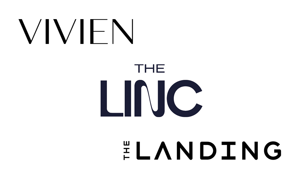
VIVIEN is an exciting, new, design-forward, multifamily community located near the vibrant Silver Lake neighborhood of Los Angeles, CA, by Sares Regis Group. Recognizing that L.A. drivers tend to move quickly, the signage was designed to be instantly clear and legible. The solution is purely typographic, but the font P11 chose adds a distinctive flair. With its all-caps style, it exudes a sense of fashion and modernity, perfectly echoing the chic interiors and residences inspired by modern fashion.
We created MBK Rental Living’s THE LINC to symbolize pathways and the community’s name. The innovative all-caps letters have more curving shapes that are intuitive and feel more like art, embodying the community’s interior design aesthetics and life in motion.
The Landing is a new multifamily community by JPI near LAX. Our all-caps solution was to add more white space within the letters by altering the capital A. It represents progress and honors the renowned international airport, emphasizing themes of aspiration, innovation, and connection.
AUTHENTIC HUMAN CONNECTION
In an increasingly digital landscape, the enduring appeal of authenticity and handcrafted design is experiencing a notable resurgence, captivating both homebuyers and renters. This trend frequently emphasizes natural elements and their integration with unique locations, reflecting a deep appreciation for organic aesthetics, sustainable living, and location.
How builders/developers/property management can use the AUTHENTIC HUMAN CONNECTION trend: Focus on outdoor amenity experiences, native plants or flowers, or symbolic scenic aspects.
Here’s how P11 utilized this trend.
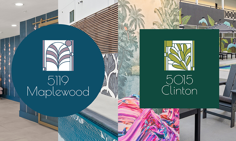
Raintree Partners enlisted P11 to strategically rebrand two of their existing apartment communities in the Hancock Park/Hollywood area of Los Angeles. The updated branding aligns with the sister properties’ recent amenity and community enhancements and design aesthetic. Recognizing the importance of cross-promotional opportunities, P11creative developed a cohesive branding approach featuring a unified logo with distinct color palettes and imagery for each property.
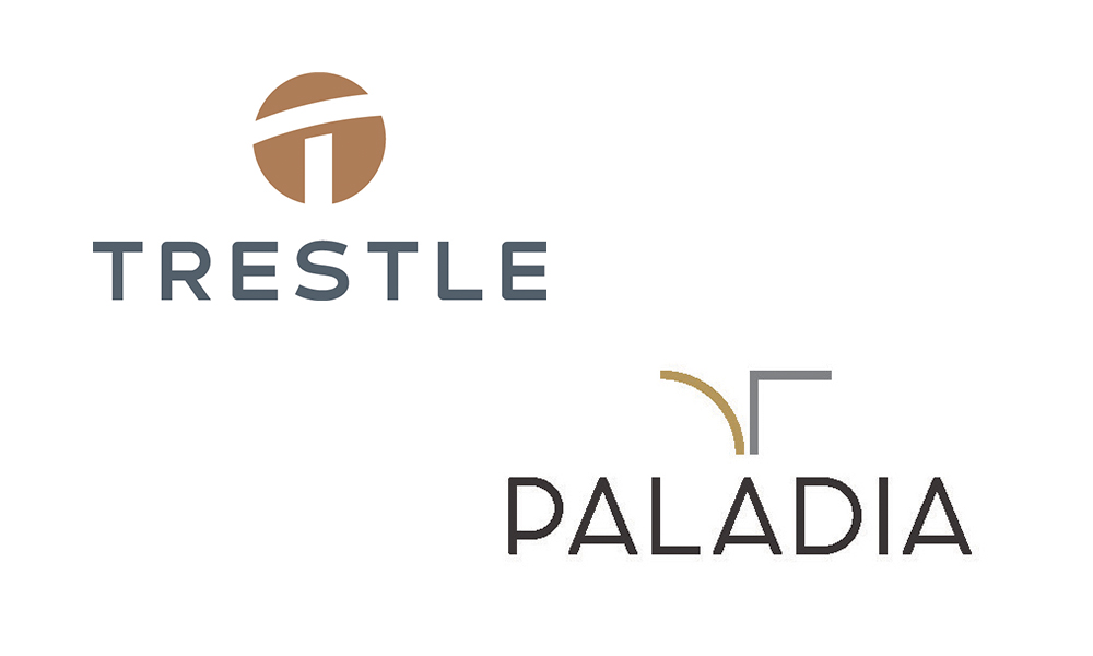
P11 teamed up with JPI and Sares Regis Group to craft the vision, naming, branding, and messaging for Trestle, a modern, transit-friendly multifamily community in Monrovia, CA, nestled in the San Gabriel Mountain foothills. A trestle is a framework consisting of a horizontal beam supported by two pairs of legs, so our icon design reflects the connection branding trend and the pedestrian bridge that links the community’s buildings and provides access to the L.A. Metro Line, making it simple to get around L.A.
Paladia was a complete rebrand and new name that P11 created for an established multifamily community in Playa Vista, CA (formerly known as Ventana Apartments), managed by SRG Residential. Our authentic connection design pays tribute to the remarkable tapestry of distinctive apartment designs nestled within a single community.
SERIF & SANS-SERIF PAIRING
Serifs are having their Renaissance moment across real estate marketing and brand ideation. They represent trust, heritage, sophistication, authority, and structure, and serve as an innate transition from the longstanding minimalist sans-serif stronghold. Part of the reason serifs are more in fashion is that their quality is better across platforms, so digital versions of serif fonts are now better for screen readability and quality. “The overly polished, hyper-uniform AI aesthetic is creating visual fatigue. As a counterreaction, designers and brands are gravitating toward typefaces that feel more grounded, textured, and imperfect. Classic and contemporary serifs will rise in popularity because they carry warmth, nuance, and a feeling of permanence.” SOURCE: CreativeBloq.com
How builders/developers/property management can use SERIF & SANS-SERIF PAIRING trend: See if your communities and brand positioning align with trust, stability, and heritage. If they do, the serif trend is an excellent choice, no matter whether your community is multifamily, for-sale, master-planned, active-adult, or luxury.
Here’s how P11 utilized this trend.
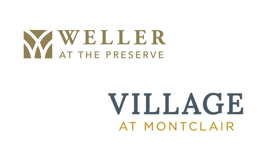
Weller is one of Greystar’s newest active adult community developments. The community is nestled between the scenic Blue Ridge Mountains of North Carolina. We created the symbolic icon and then paired a serif with a sans serif of equal width to embody timeless surroundings balanced with a modern living and amenity experience.
Creating a personal sense of real connection and a sense of place were the basis for these serif and sans-serif pairings for this new multifamily community’s branding, created by P11 for Village Partners and Legacy Partners in Montclair, CA. The serif typeface honors the piazza-inspired, amenity-gathering spaces, and the sans-serif brings a sleek, modern touch to the Metrolink station. See the website we created for Village at Montclair now.
BOLD & COLORFUL
We love the big-and-bold type trend in branding because it really captures attention — and it’s a lot of fun. It’s also a natural response to the proliferation and longevity of minimalist, lightweight fonts. If you’re looking to be more expressive and gregarious, big, colorful, and bold is the way to go. Sorry, Pantone Cloud Dancer. People crave joy and happiness, not blandness and lifelessness.
How builders/developers/property management can use the BOLD & COLORFUL trend: Try a big, friendly type for a special lease-up promotion, freshen a digital campaign to feel warmer and more joyful, and/or create eye-catching social media content. Bust out some bright, high-energy colors to create more of a vibe that resonates with your target market. Consumers everywhere are responding to them.
Here’s how P11 utilized this trend.
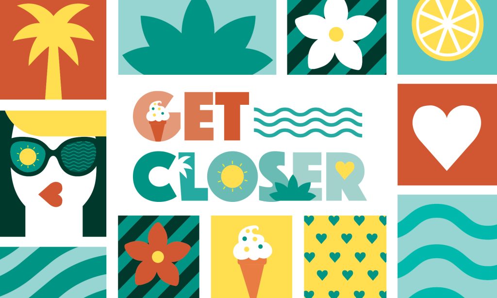
At P11creative, we don’t just market new homes, we create and tell stories that resonate with homebuyers. That’s the heart behind our new Get Closer campaign for Vistera of Venice, a thoughtfully designed, award-winning master-planned community in Southwest Florida with single-family homes and paired villas for sale created by Neal Land & Neighborhoods. It was a strategic response to a shift in the target audience from primarily retirees to include young families along with the retirees. This shift presented a great opportunity to use a bigger, bolder font in a warmer, more emotive, and attention-getting campaign. We honored the Vistera branding design by staying true to it.
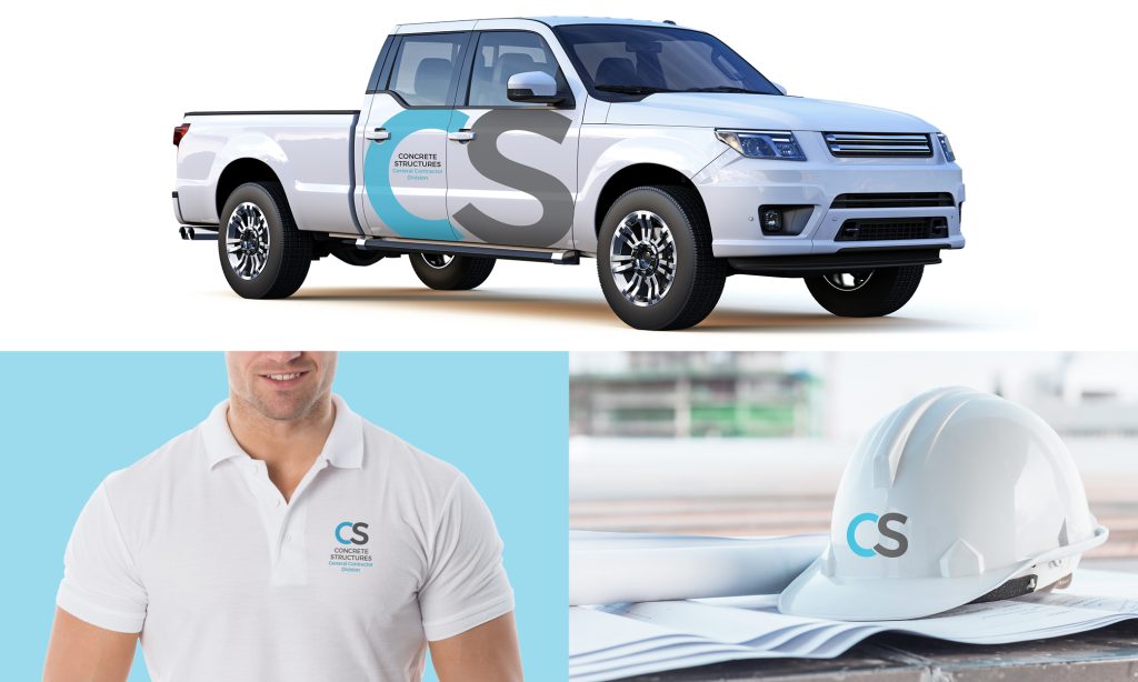
P11creative branded and launched a new division of Concrete Structures, a self-performing general contractor with nearly sixty years of experience and over 3,000 projects in various sectors completed across the US. The branding design we developed conveys a dual message of stability and innovation, while utilizing the bold type trend and carefully aligning with the core ethos of Concrete Structures’ operations and its commitment to excellence in construction. We designed the logo with large uppercase letters in a clean, modern style to elevate the business and ensure it is easily recognizable across all implementations.
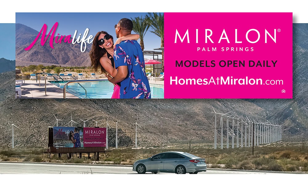
When you have a chance to use hot pink strategically and effectively, you take it! P11 fully immersed itself in bold colors and expressive typography for the “Mira” campaign, which highlights the master-planned community Miralon in Palm Springs, CA. It complemented the vibrant amenities and target market and truly captured the energetic spirit of living in such an iconic, legendary area.
STORYTELLING
Identity design used to be a one-trick pony. Not anymore. The trend in 2026 is to have your branding embody your brand’s promise or values. This storytelling approach gives your brand a chance to express real personality and emotions. People are more responsive to marketing when they can feel it. Simple but immediate symbolism is highly effective at creating positive inferences in consumers’ minds.
How builders/developers/property management can use the STORYTELLING trend: Take a hike. No. literally, take one. Explore the surroundings of your community and understand the passions of your target market. For The Dendry, it is hiking and all things outdoors. Think of one thing that symbolizes those two things and incorporate it into your branding design.
Here’s how P11 utilized this trend.
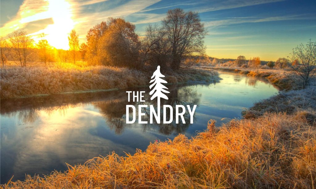
The Dendry, a brand new build-to-rent townhome community developed by Foulger Pratt, is located on the banks of the Provo River in Provo, Utah. Our inspirations were the scenic location, outdoor amenities, and immediate relaxation of fresh, clean air. A single pine tree as an extension of the letter “N” embodied this brand’s story and innate sense of connection to live well, location, and lifestyle.
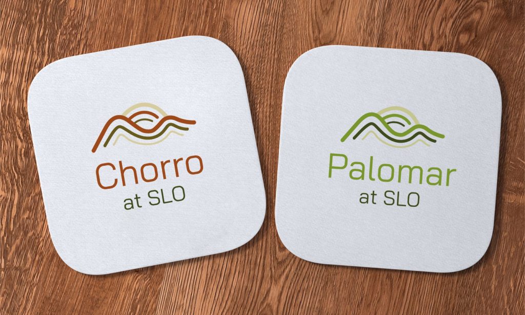
Warmington Apartment Communities asked P11 to rebrand two newly acquired student housing communities near California Polytechnic University, San Luis Obispo. We considered college students’ tastes, hobbies, and preferences and developed fresh, hip branding that feels welcoming and thoughtfully crafted. The design features Cerro San Luis and the Bishop Peaks, symbolizing the new opportunities each day brings for students. The color palette is earthy and authentic, designed to connect with residents seeking stylish, meaningful, and elevated housing.
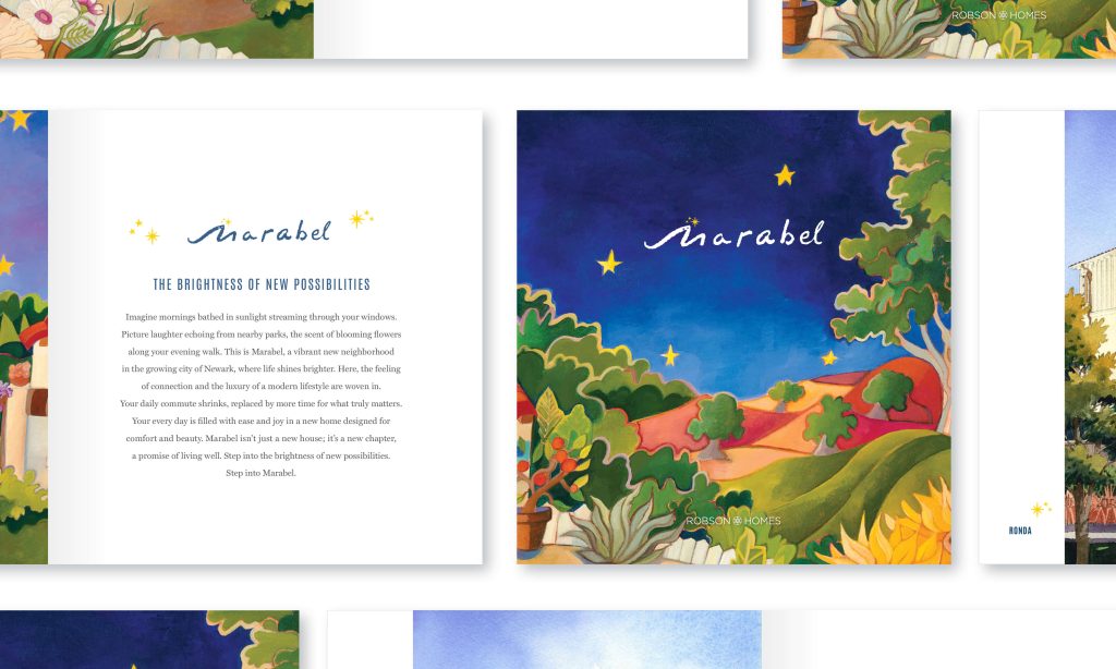
Robson Homes, a highly accomplished developer in Northern California, selected P11 to market their latest community, Marabel, in Newark, CA. The main concept in the branding was hand craftsmanship. So, we leaned into the storytelling trend with this branding that evokes custom ironwork, the romantic nature of Spanish-style architecture, and the dreamy starry skies, custom-illustrated by the client’s commissioned artist.
KINETIC
Creating deliberate energy, flow, and an uplifting vibe in branding is truly captivating. It introduces a subtle sophistication without appearing forced. The kinetic type and branding trend work really well with the popularity of motion graphics. They introduce a subtle rhythm and flow that enhances engagement.
How you can use the KINETIC trend: Use it sparingly and mindfully in your branding design. Strive for one or no more than two letters in the brand name that can benefit from this nuance. This keeps it elegant. Too much embellishment and the kinetic design will lose its appeal and appear too busy. When marketing looks too busy, consumers turn away.
Here’s how P11 utilized this trend.

This new, nationwide build-to-rent company was established to offer today’s renters more options. We named and positioned the company and designed a dynamic, aspirational logo for Skymor, targeting current tenants who want to experience the feeling of living in a true single-family home within a thriving, tranquil, and established master-planned community. The upper part of the letter K reaches skyward, while the light blue color pays tribute to the company’s name.
Life as an art director and branding specialist comes with thousands of choices. A huge part of the kinetic trend is knowing what to modify and what to leave alone. This upscale branding for Arista, a multifamily community in downtown Glendale, CA, needed that extra touch of elegance. The community comprises a reimagined building and an entirely new tower, which were once commercial office spaces. The capital A in the name was slightly modified to give it more distinction with this kinetic design solution. It seamlessly works with the lowercase letters of this specialty font for a unique solution.
A new luxury apartment community in North Kingstown, Rhode Island, by Moran Properties needed a brand design that radiated boutique-hotel elegance, emphasizing first-class service while staying true to the East Coast’s sophisticated vibe and a discerning luxury audience. P11’s dynamic solution featured the subtle ‘sway” of the capital “N’s, creating a confident, upscale look reminiscent of custom iron architectural details. The stacked design cleverly leverages the three-letter words in the name to achieve perfect visual balance and is reminiscent of the exterior architecture.
AUTHENTIC & DOWN TO EARTH
For many years now, branding and design have been minimal to the point of being extreme. With the proliferation of this look, brands are losing consumer attention. They want more original ideas now and less templated-looking solutions. “DIY aesthetics are returning in 2026. Work looks more handmade, more imperfect, and also more human.” SOURCE: TheBrandingJournal.com
How to use the AUTHENTIC & DOWN-TO-EARTH trend: If your community embodies a suburban, urban, or desert vibe, embrace it. The saying “location, location, location” remains crucial in multifamily marketing. Infuse your brand’s design elements with a more relaxed, organic feel to make your community’s identity stand out as artistic and captivating, highlighting its unique setting.
Here’s how P11 utilized this trend.

For JPI’s new luxury multifamily community in Riverside, CA, P11 celebrates the area’s rich agricultural heritage while showcasing a bold, innovative vision for modern living. Drawing inspiration from the authentic, down-to-earth trend that resonates with the community’s roots, P11 developed a contemporary branding solution that hints at the vibrant, colorful interior design palette and distinctive features of the development, offering a preview of the lively atmosphere residents can expect.
Greystar, one of the top leaders in multifamily communities, tasked P11 with rebranding a new luxury acquisition in Phoenix, AZ. After conducting a thorough analysis of the community, competitors, and target market (the existing residents as well as the prospects), BASK Deer Valley was born. The BASK concept represents a luxury brand where residents take time to celebrate everything in life found here: inspiration, sophistication, and desert serenity, while telling a bigger and more meaningful story. The sculpted sun-and-water icon complements the color palette of the existing architectural details and creates the perfect balance of sun and sleek. The type hierarchy reinforces a highly desired sense of place in suburban Arizona.
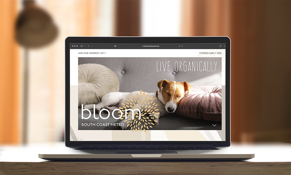
This new multifamily community, in one of the most desired areas in Orange County, CA (South Coast Metro), is from Legacy Partners. This location is in nice proximity to South Coast Plaza and its world-class culture and dining. The interior design concepts were very boho chic and fluid. The identity needed to balance nature, tranquility, and luxury. The craft-stamp-inspired look of the flower in the branding is light and airy, and the lowercase sans-serif font pairs well with it. So well, P11 earned a Gold Award at The Nationals for the brand design.
SUMMARY: SUCCESSFUL BRANDING IS ABOUT BEING RELEVANT.
From bold, unapologetic simplicity and explosive color stories to deeply human storytelling, the 2026 branding trends are driven by passionate experts who ignite them and bring them to life with relentless quality and execution across all platforms, fueling the success of our strategic partners. Real estate branding that breaks the mold won’t chase every fleeting trend — they’ll craft designs with intention, attitude, and purpose. We believe design isn’t just about how a brand looks — it’s about how it hits hard, connects fiercely, and earns unwavering trust with your audience and your results. That’s what P11creative has been rocking for nearly 40 years. And we’re ready to do it for you, too.
Learn about P11’s brand ideation solutions now.
Let’s connect to discuss your real estate marketing and branding needs today, and be sure to sign up for our ON STAGE Enewsletter to stay in the know.
See How We Turn Ideas Into Results
Related Articles
Stay updated with the latest trends, strategies, and best practices in real estate marketing.


Partner with P11 to turn your real estate brand and properties into powerful marketing machines.