Ledge & Laurel: How P11 Unified Two Austin Apartment Communities Into One Standout Multifamily Brand



Ledge & Laurel: How P11 Unified Two Austin Apartment Communities Into One Standout Multifamily Brand
When SRG set out to combine Museo and Channings Mark, two adjacent and established apartment communities in Austin, TX, the goal was clear: stop competing with yourself and start leading the market as one. The new name was already chosen Ledge & Laurel. Our job at P11creative was to turn that name into a living, breathing multifamily brand that residents and prospects instantly understand, remember and want to call home.
Two Communities, One Identity: The Rebranding Challenge
Merging two existing multifamily communities into a single brand is more than a logo swap. Each property came with its own name recognition, resident loyalty, online reviews and digital footprint. Prospects searching Austin apartments saw two listings, two websites and two stories that never quite connected.
A successful multifamily rebrand has to honor what already works while giving everyone a reason to see the property with fresh eyes. That takes curation, imagination and strategic execution. It means aligning signage, wayfinding, website, social channels and leasing materials so the transition feels seamless to current residents and exciting to future ones.
Two Communities, One Identity: The Rebranding Challenge
Merging two existing multifamily communities into a single brand is more than a logo swap. Each property came with its own name recognition, resident loyalty, online reviews and digital footprint. Prospects searching Austin apartments saw two listings, two websites and two stories that never quite connected.
A successful multifamily rebrand has to honor what already works while giving everyone a reason to see the property with fresh eyes. That takes curation, imagination and strategic execution. It means aligning signage, wayfinding, website, social channels and leasing materials so the transition feels seamless to current residents and exciting to future ones.
Why Ledge & Laurel Works
We love this name, and for good reason. The alliteration rolls off the tongue, which makes it easy to say, easy to search and hard to forget. In a crowded Austin rental market, memorability is a real competitive advantage.
The name also carries a meaningful story. A ledge is solid ground: a place to land, settle in and see the city from a new vantage point. Laurel represents growth and flourishing, the reward of a life well lived. Together they tell the story of arrival and thriving, of finding your footing in Austin and then truly living well.
That story fits the city perfectly. Austin blends rugged limestone, live oaks and authentic natural beauty with bold, modern ambition. Ledge & Laurel captures both sides of that personality in just three words.
A Brand Identity Built on Stone and Greenery
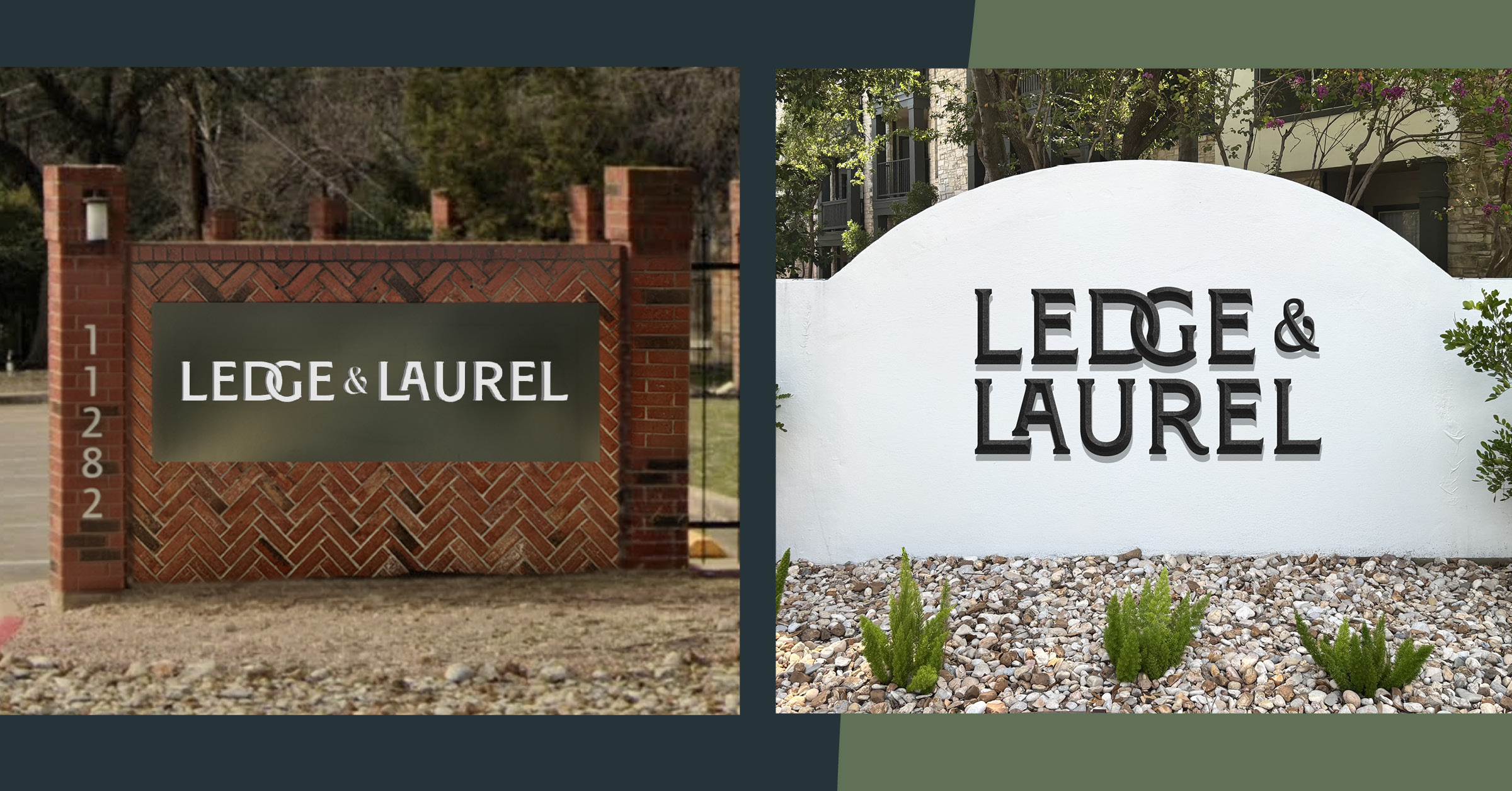
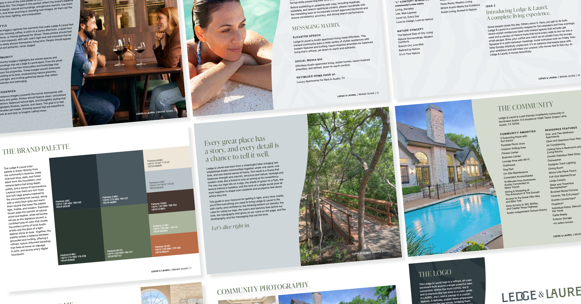
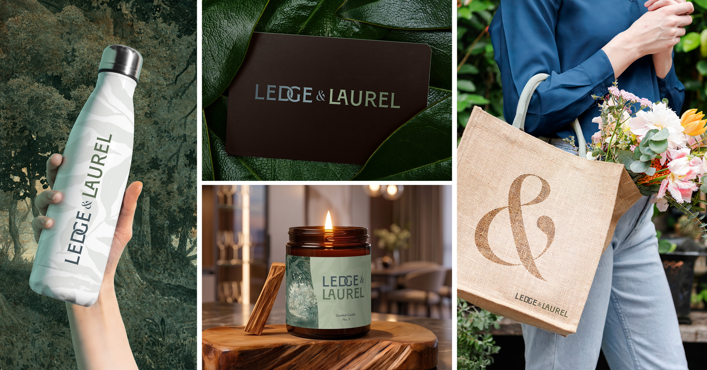
The visual language of Ledge & Laurel draws directly from its name. On one side sits stone and structure: grounded textures, confident lines and a sense of permanence. On the other side sits greenery and craft: organic forms, warm natural tones and a handmade touch. This balance gives the brand identity real flexibility. It feels at home on monument signage and leasing office walls just as easily as on a website hero image or an Instagram post. Most importantly, it gives residents of both former communities a shared identity that feels fresh, elevated and unmistakably Austin.
P11 Has A Proven Track Record in Multifamily Rebranding
Ledge & Laurel joins a growing portfolio of multifamily communities P11 repositioned and relaunched.
• Paladia, Playa Vista, CA: Our previous partnership with SRG Residential transformed Ventana Apartments into Paladia, a fully reimagined community for the Silicon Beach market. The work included a vision book, positioning strategy, naming study, branding overhaul and website redesign.
• Warmington Student Housing, San Luis Obispo, CA: Two newly acquired communities serving Cal Poly were branded as the perfect pair. Each kept its own name and color palette while sharing a unified typography story and design system.
• Greystar, Phoenix, AZ: A complete rebrand for a new luxury acquisition, noted in our branding trends roundup.
• The Tyler at Loveland: A multifamily rebrand delivered under a tight deadline.
Whether you own one community or a portfolio, P11 knows how to breathe new life into existing assets and turn them into brands that lease.
Ready to Rebrand Your Community?
Is your property struggling to stand out? Are two adjacent communities splitting your marketing budget and confusing your prospects? Has a recent acquisition left you with a name that no longer fits?
P11creative is the multifamily marketing agency that real estate leaders trust to name, brand, position and launch communities that perform. From naming studies and brand identity to signage, websites and digital marketing, we handle every detail so your team can focus on leasing.
Let's build your next success story together. Contact P11 today to start your multifamily rebrand now.
See How We Turn Ideas Into Results
Related Articles
Stay updated with the latest trends, strategies, and best practices in real estate marketing.




Partner with P11 to turn your real estate brand and properties into powerful marketing machines.